Wednesday, September 24, 2008

Applying Principles of Colour to Miu Miu F/W 08


This blog gives and analysis of the colour scheme of the Miu Miu Fall/Winter 2008 ready-to-wear Collection

This collections is based on sport, but taking it "in a new direction", Miuccia Prada


The Collection takes the sports theme literally, with bold, colour-blocked jumpsuits and fitted horse hoods tied under the chin. However, there is a diversion from this with densely knitted blouson sweaters over long shorts and track jackets with straight skirts, as well as shift dresses in lace and jersey. For evening, matte sequins were incorporated into the designs.


The images below depict high value hues with low chroma. The high value shades of plum red and bottle green, when contrasted with the black, create harmony and balance.


Monochromatic Colour Scheme:


PRINICPLE OF RESEMEBLENCE - this states that colours harmonise more when the difference between them is less. In this case, it justifies Miu Miu's selection of light and dark colours of the same hue.

The images above have similar colour schemes, in that they all use 2 colours of the same hue but with differing chromas and values. For example, above, one can see the use of a variety of different values and levels of chroma of green and orange. The lack of contrast creates a sublte, harmonious effect.

THE PRINCIPLE OF ORDER can also be applied to the outfits above as they use an achromatic colour scheme. The designs on the left and centre have subtle differences between the grey and black shades and tones, combined with the low chroma green hue.

Analogous Colour Combinations:

Analogous colour plans are based on a limited number of adjacent hues. Below are examples of Miu Miu's application of this colour combination, where red and orange have been used. The contrast between them is not very strong, which relates to the principle of resemblence, but when paired with the black, a strong contrast is created, giving both colours a stronger impact.


Monochromatic Colour Scheme

Below are examples of the application of the PRINCIPLE OF ORDER, but applied in a different way. Miu Miu uses one hue of a high value and chroma and pairs it with black to create impact. Differing the hue for each piece, but keeping the high value and chroma creates consistancy between each piece and makes it clear that it is from one collection.


Diad Colour Scheme

This scheme involves using 2 colours apart on the colour wheel. Using contrasting colours creates high impact. The hues below have high chroma and high value, and when combined with black, this is especially enhanced.

orange & green red & green


Achromatic Scheme


This is a colour scheme. Miu Miu has used black as a base to tie all the pieces in the collection together. Below are examples where different shades of black have been used to create a subtle effect.



Friday, September 19, 2008

Applying Colour Theories to the Burberry Check


This blog gives an analysis of the Burberry check colour scheme, focusing on its hues, values and chroma.

The black white and red pattern, known as Haymarket check or the Burberry Classic check was created in the 1920s and was first used as a lining. In the 1960s it became a registered trademark and is now an iconic feature of Burberry.


The Burberry check is inspired by the traditional Scottish tartan check which commonly uses basic primary and secondary hues such as red, yellow green and blue with high chroma and value. Tartan normally has a strong contrast between aggressive and receding colours which gives impact to the eye. The example below has a variety of shades of blue and navy, which creates harmony and makes the contrast in colours subtle.


The Burberry check uses a blend of two different colour theories: the Complimentary Colour Scheme Theory and The Achromatic theory. The Complimentary Colour Scheme Theory relates to the two hues opposite each other on the colour wheel, the deep red shade and the beige tint. When combined, the two colours are intensified. The Achromatic theory relates to the colourless scheme of blacks, whites and greys. The transparency of the black in the check creates grey tones. Black, grey and white can be included in a colour scheme without distorting its formula because they are true neutrals. This is called monochromatic, even though no hue is involved, both the black and the white make striking accents and compliment the red well, bringing about balance and harmony.

The colour scheme is sophisticated and muted. The low value tints of brown/beige as a base and shades of black and red. The red hue is not very vivid, therefore has low chroma. This gives the pattern a luxurious and warm feel. The achromatic scheme consisting of dominant black shades and white tints combined with the low chroma of red, creates a strong contrast.

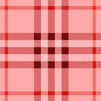
From understanding the composition of the Burberry Check Colour Scheme, the theories can be applied to create other colour schemes. Below are variations of the Burberry check, with altered hues, chromas and values:

Thefollowing colour schemes are mono-chromatic, using only one hue, but differing shades and tints.


This colour scheme has a blue hue with a contrasting tints of black and a mid saturation with a high chroma and high value


This example has high value and constant chroma. The predominant hue is a tertiary colour: yellow-green


This example uses the same hues as the original sample but with much lower value and chroma. The colours are therefore very dull with shades of grey.


This example has a red hue with a medium chroma, low value and high saturation